Living in Washington changed the way I see color long before it changed the way I chose paint. Here, light is never predictable, never fixed, and never purely bright. It moves slowly, filtered through clouds, trees, mist, and rain, and it shifts without asking permission.
Some mornings feel pale and blue-gray. Some afternoons surprise you with warmth that lasts only an hour. Other days never lift at all.
When I first moved here, I did what I had always done before. I chose paint colors based on how they looked on small cards under store lighting, trusting the names and descriptions to guide me.
Soft white. Warm beige. Light gray. They all sounded right. None of them felt right once they were on my walls.
It took time to understand that the problem was not my taste. It was my relationship with light.
The First Time a Perfect Color Felt Completely Wrong
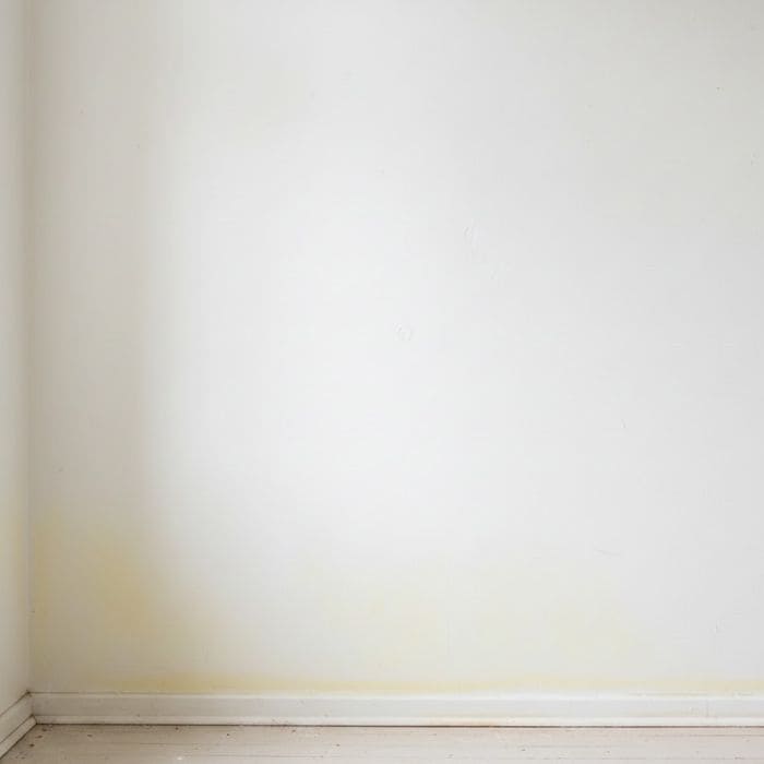
I remember one of the first rooms I painted after moving here. I chose a white that was described as warm and inviting, something that looked calm and balanced in the store.
When I painted it on the wall, it looked fine during the afternoon. But the next morning, under cloudy light, it felt dull and slightly yellow. By evening, it looked flat and tired, almost heavy.
I lived with it for weeks, hoping my eyes would adjust. They did not. Every time I walked into the room, I felt a small resistance, like the walls were quietly disagreeing with the space.
That was the moment I realized paint color is not about how it looks once. It is about how it lives.
Understanding Washington Light as a Daily Companion
In Washington, natural light is rarely direct. Even on sunny days, it tends to arrive softly, bouncing off moisture in the air or filtering through trees.
Clouds act like a diffuser, spreading light evenly but muting contrast. Shadows are softer here, but they last longer.
I started paying attention to how rooms felt at different times of day. Mornings often felt cool and still. Midday could brighten suddenly if clouds broke. Late afternoons faded earlier than expected, especially in fall and winter. The same wall could look completely different within a few hours.
I learned that if a color only looks good during one part of the day, it does not belong in my home.
Why I Stopped Making Decisions Quickly

I used to think choosing paint was something you did efficiently. Pick a color, paint the room, move on.
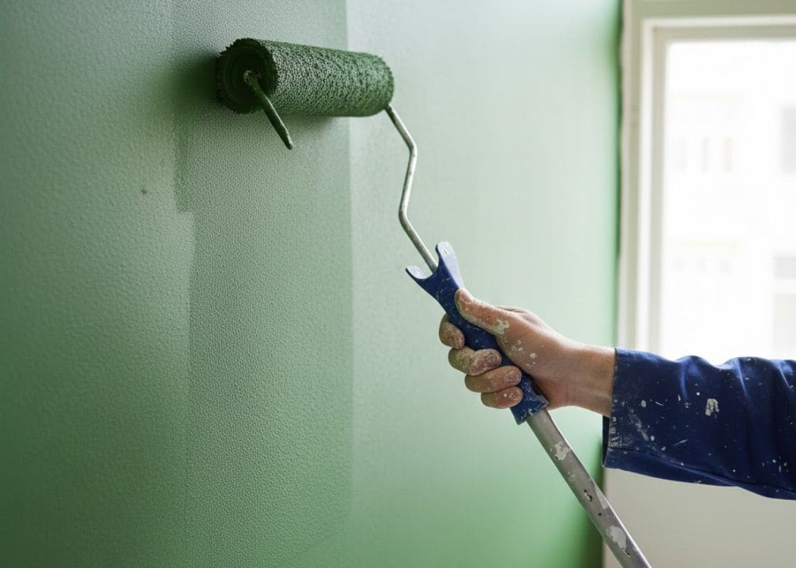
Washington taught me patience. Now, I test colors slowly and deliberately, sometimes living with a sample patch for a full week.
I paint small sections in different areas of the room, near windows, in shadowed corners, and on walls that catch reflected light from outside.
I watch how the color responds to rain-heavy mornings, bright breaks in the clouds, and long evenings when natural light fades early.
What surprises me most often is how a color behaves when I am not paying attention. If I forget about it and still feel comfortable in the space, that tells me more than any focused evaluation.
The Emotional Side of Living With Color
Color affects mood more deeply here because light already carries emotion. Gray skies can feel calm or heavy depending on what surrounds them.
A paint color that is too cool can amplify that heaviness. One that is too warm can feel artificial against muted daylight.
I began choosing colors based on how I wanted to feel during the hardest light moments, not the easiest ones.
I asked myself how a room would feel on a long, rainy afternoon in November, or during a dim winter morning when the sun does not rise quickly.
If a color could hold me during those moments, I knew it would work the rest of the year.
How My Palette Shifted Over Time
Before Washington, I loved crisp whites and cool grays. Here, many of those shades felt sharp or cold, especially during long stretches of overcast weather. Gradually, without forcing it, my preferences shifted.
I started leaning toward whites with softness underneath them, not creamy or yellow, but gentle.
Grays that leaned warm rather than blue. Neutrals that reflected light instead of absorbing it. These colors did not announce themselves. They supported the room quietly.
I realized I was no longer decorating for style. I was decorating for comfort.
The Influence of Reflected Light
One thing I did not understand at first was how much reflected light matters here. Light in Washington often bounces off trees, wet pavement, neighboring buildings, and even the sky itself. That reflected light carries color with it.
A wall facing greenery can pick up a subtle green cast. A wall facing open sky can feel cooler and more muted. I learned to observe what my walls were reflecting before choosing a paint color.
Instead of fighting those reflections, I began choosing colors that balanced them, neutrals that stayed steady even when the light around them shifted.
Seasonal Awareness Changed Everything
Paint does not change with the seasons, but light does. Summer brings longer days and softer evenings. Winter brings short, dim days and heavy cloud cover. Spring and fall shift unpredictably between the two.
I started testing colors during less flattering seasons on purpose. If a color felt good in winter, it would feel even better in summer. That approach saved me from repainting more than once.
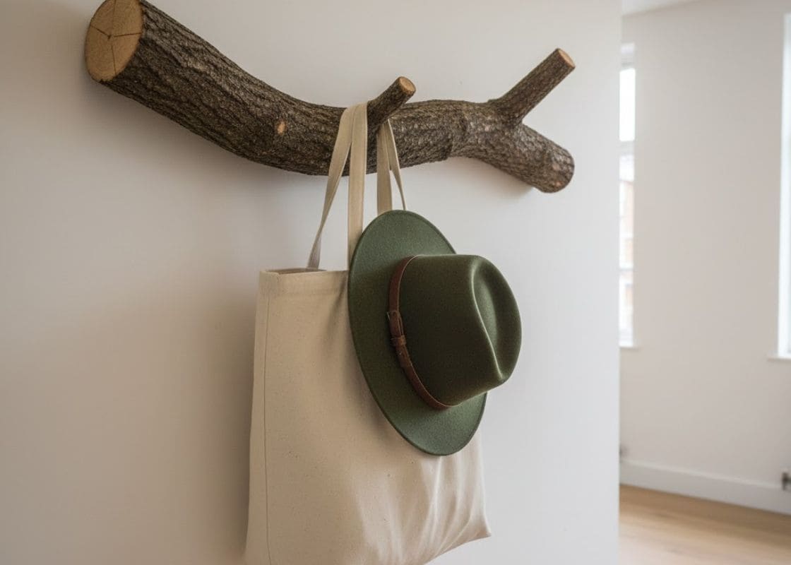
Plus, in a place where light is already dynamic, bold wall colors can feel overwhelming. I learned to let walls be quiet so other elements could breathe.
Furniture, art, plants, and natural textures stand out more when the background supports them rather than competes.
Calm walls allow light to become the feature, and in Washington, light deserves that role.
Living With Paint Before Committing Fully
One of my most important rules now is to live with a color before committing. I leave sample patches up longer than feels necessary.
I notice how I feel walking past them without thinking. I observe whether the color ever irritates me, even slightly. If a color disappears into the background in a good way, I know it is right.